There are certain designers in this world who continue to set the standard high and Jenny Komenda is one of them. Whether it’s her ability to transform various spaces into beautiful homes or her wide recognition from channels such as HGTV, Jenny’s talent is obvious and her passion to share it is what makes her memorable.
As an interior designer, blogger, and small business owner of Jupiter Studio, Jenny’s life is full of creative projects. Her most recent one? A collaboration with Overstock to redesign a living space for a family of three. Modern and kid-friendly, this home incorporates stylish features that can only be proved incredible once you’ve seen the before-and-after photos. Here, we chat with Jenny on her secrets to decorating and to the homeowners on their favorite part of their upgraded space.
We love how stylish and family-friendly this beautiful home is! What are some key things you think about when decorating for a family?
When decorating for a family, we try to get a really good feel for how the family actually lives in the space. What will the space be used for? Family hangout spot? A place to do homework? It helps to know what functions the room will be expected to perform when making the overall design plan, so we can ensure all the needs of the family get met.
Walk us through the main design needs of the family. How did you blend your design style with the needs of the family?
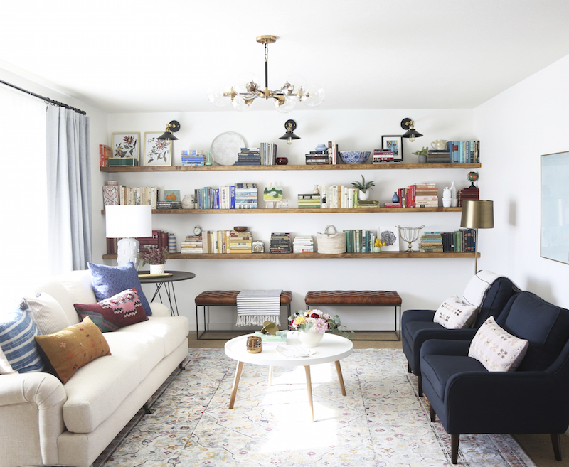
This family doesn’t own a TV, so that really freed us up to make a living space that focused more on conversation and family time, rather than a space for TV watching. Overstock.com was a great partner on this project, and we were able to find the perfect pieces to bring the room to life with their help. We placed a sofa across from two chairs to help invite the family to sit and chat or play games. We also placed two leather ottomans under the floating shelves, which can act as extra seating when they have visitors over.
The homeowners, both teachers, requested a desk in the living room for getting work done at home. I love the vintage desk we put in here. We styled it more like a console table than a workspace, so it doesn’t look out of place in their living room.
The dining room also needed some tweaking to help it function better for this family. We replaced their small square table with a much larger rectangular table that better fit the space as well as two credenzas from Overstock along the back wall. Now there’s plenty of storage and the room feel filled out in a really comfortable, homey way.
BEFORE
AFTER


The living room shelving is to die for! When it comes to organizing books, toys, and kid gear, what are your tips for storage and organization?
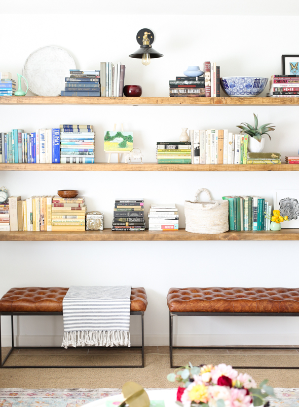
When styling shelves for a family with young children, it helps to keep your decorative and more prized pieces up high, and the kid-friendly/less precious items down low. We filled decorative baskets with small toys and blocks for this family’s young daughter, and it’s great that she feels like she can interact with the space, too.
I love to loosely organize books by color and in small groupings. This helps to keep your eye moving across the shelf. I also like to stack books horizontally. The stack of books acts almost like a bookend, helping to keep your vertical books upright, as well as a great place to put small decorative objects like vases or frames.
It’s also important to make sure there is a nice balance of color, texture, and scale with the decorative items on the shelves. I especially like using small plants, woven trays, handmade ceramics and small pieces of art on easels. I love incorporating sentimental items here too!


It’s not uncommon for families to want to decorate with personal mementos–family photos or what not. Often times it can be overdone…How do you recommend incorporating personal photos and memories into such gorgeous design? Any “rules to follow” when decorating with personal photos?
I think it is really important for people to incorporate family photos and mementos into their spaces. Your home should be a reflection of the people who live in it! If photos, family heirlooms, or souvenirs from trips make you happy, you should be proudly displaying them in your home! A fun way to incorporate large-scale family photos is to use unique sized framing options or frames with large matting. For this space, we found some vintage frames with round matting and it creates more of an artistic, gallery style look. I also usually prefer using candid family photos!

We love your twist on this gallery wall; what goes into a great gallery wall? Do you have specific design rules to follow to help guide readers in creating their own?
Pulling off the perfect gallery wall is all about finding the right mix of color, sizes, and textures in your art pieces! I like to use framed prints, original art as well as some quirky thrift finds. A gallery wall is also a really fun way to incorporate kids’ art into your home without it looking too out of place.
I usually like to have a plan before I start hanging the art on my gallery wall. Measure out your space and tape it out on the floor. Then you can play with the placement. If you are using multiple colored frames this can also help make sure you get each color evenly dispersed, so it isn’t too light or dark on one side.
Since the rest of this dining room leaned more neutral, we didn’t limit the colors we used in this gallery wall. If you want to create a more scaled back version, try limiting yourself to a specific color palette.
BEFORE
 AFTER
AFTER


A lot of people struggle with choosing kid- and pet-friendly furniture. What are your favorite kid-friendly fabrics and materials? Any tips for mixing and matching so it isn’t just a lot of dark pieces?
I think it is a common misconception that you can’t have lighter fabrics with kids or pets, and Overstock had plenty of lighter options for us to choose from. If you do decide to go with a lighter color, try to pick a fabric that has some color variation or movement to it, like the oatmeal woven fabric on the sofa here. This will help hide any stains or spot cleaning you have to do. Another extremely durable option is leather. It is practically indestructible and only gets better with age and wear! I usually avoid rugs with any bright white sections, even in houses without kids and pets! They always end up looking dingy in a few months. That said, I like how the Safavieh rug in this space is on the lighter side. All the pattern helps to hide stains and crumbs!
BEFORE
 AFTER
AFTER


And now, we sat down the family who worked with Jenny to upgrade their space.
What is your favorite part of the space Jenny created?
When we first walked into our house after the makeover, it took us a few minutes to be sure that they hadn’t raised the ceilings or knocked down walls, because our house looked so much bigger and brighter. It was truly transformed. Eventually, we realized it was the white paint that made everything look so light and bright. There are so many things we love about Jenny’s design, but the fresh white paint on the walls is one of our favorite parts. It made the warm-toned floors and countertops, which used to really bother us, look so much more neutral. It also made our whole home feel bigger and lighter.
It’s impossible to pick just one favorite part, so here are a few more.
The new living room layout of the couch and chairs have made our whole home flow better and feel more spacious. The dining table fits so well in our space, and combined with the credenzas, it makes our previously really empty dining room feel balanced. We love all the beautiful furniture from Overstock.
Every time I come home and walk in from my garage, the first thing I see is a view of the beautiful gallery wall. It honestly still takes my breath away every time! All the art and photos from Jenny’s Print Shop are beautiful, and the scale of the frames and photo rail is so stunning.
The wood shelves Jenny built make our house feel so special. They are gorgeous and styled with so many beautiful touches. We love our books and feel really lucky to have had such a beautiful, custom element added to our home.

What are your priorities when it comes to having a family-friendly home?
We have a small house and a very adventurous toddler, so it’s really important to us that every part of our house is relatively child-proof and easy to play in. We really value having a home where nothing is too fragile or fancy to let her play. Jenny and her team did an amazing job making our house look absolutely beautiful but still be a fun, safe space for our daughter to play. The fabrics are all durable, there are no sharp corners and there is nothing too precious within reach of our little girl. We appreciate that the shelves in the living room are well-anchored and start a few feet off the ground. We always worried about our bookshelves tipping over on our kids before! We love that the dining chairs are lightweight for when she inevitably climbs on and knocks them over (it’s already happened and no injuries!). And our daughter could spend hours building block towers on the low, round coffee table that is equal parts beautiful and functional.
BEFORE
 AFTER
AFTER 

What is the biggest thing you learned design-wise from what Jenny was able to do with your home?
I learned so much about proportion and scale from what Jenny was able to do with our home. Our house is small, so I always assumed our furniture should be small too. Jenny’s design taught me how important it is to fill our whole space. The side table next to the couch is much larger than I would have thought to do, and it looks so great in the room. The layered rugs cover a lot of surface area and make our home look much bigger than before. I never realized larger rugs could make such an impact! The shelves she made go wall to wall and floor to ceiling, and filling up all that visual space makes our house feel so much more spacious than it did before. It’s the same thing with the picture rail in the dining room. Our house feels full, finished, and balanced now.


